Four Principles to Achieve Contemporary and Lasting Store Design
Environmental design is continually evolving. That can be a stressful challenge for retailers and other businesses with public spaces.
It’s important to distinguish between temporary trends and innovations with staying power that serve customer wants and needs, now and into the future.
So here are four environmental design focuses that Miller Zell’s creative team view as both contemporary and lasting.
-
-
Flexible layouts, multi-functional spaces
-
Technological integration
-
Memorable moments
-
Eco-friendly design & sustainability
-
Let’s discuss.
Flexible layouts, multi-functional spaces
Change is good. So is flexibility.
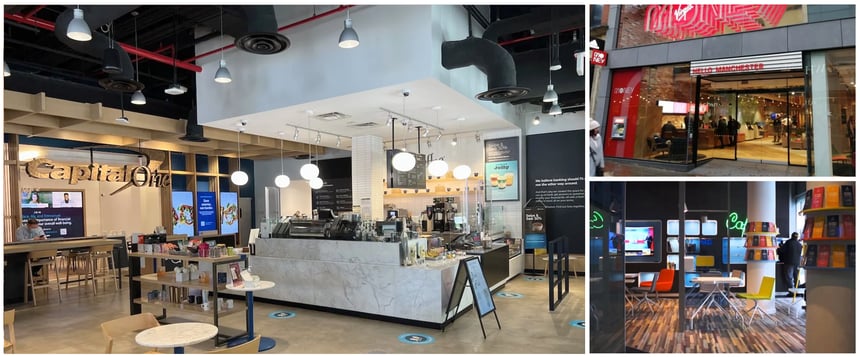
Some savvy businesses with branded environments, including retailers and bank branches, are creating multi-functional spaces, adapting their interiors to include allotments for coffee bars, lounge waiting areas or even co-working spaces. These drive a sense of community, convenience and support.
This also includes designs that feature flexible layouts that support temporary structures, such as pop-up stores or rotating in-store experiences.
Modular designs anticipate these changes, whether monthly, seasonal or date-specific, providing opportunities for high-impact visuals that are are easy to change out, whether these are fixtures with graphics or digital displays.
Ensuring spaces can regularly present a new feel to customers enhances their experience and inspires loyalty, particularly when it reduces redundancy while not complicating the wayfinding of shoppers on specific trip missions.
 From left to right clockwise: Capital One Café located in West Palm Beach, Florida; Virgin Money located in Manchester, England; KM COOL SPACE located in Shantou, China.
Technological integration
It’s not about cool technology for its own sake. It’s about innovation that serves purposes and improves the customer experience. Optimized omnichannel retail is when digital elements are integrated seamlessly, and all potential paths to purchase are intuitive and friction-free.
In design terms, it’s when physical and digital elements play together to create something immersive, emotive and memorable.
Augmented reality (AR) and virtual reality (VR) are no longer simply about a “Wow!” factor. Implemented strategically, they can boost an immersive shopping experience.
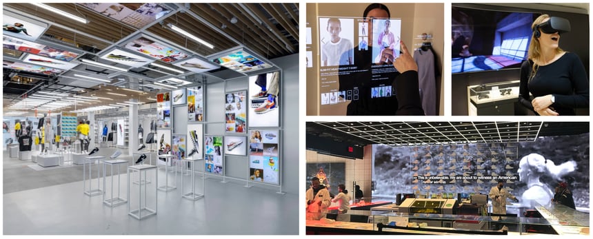
Smart mirrors and interactive displays can allow customers to try on products or visualize them in another space, such as a customer’s home.
AI can boost personalization shopping, both in-store and online, and in-store customizations allow customers to create a product or sequence of connected products specifically tailored to their liking.
And technology will continue to play an evolving and critical role in improving both BOPIS (buy online, pick up in store) and automated or self-checkout.
 From left to right clockwise: Nike SOHO located in New York, New York; H&M located in Beverly Hills, California; Nike flagship store located in New York, New York.
Memorable moments
Sometimes, something unexpected drives customer intrigue.
There are dramatic, maximalist techniques, using bold colors, bespoke patterns and layered materials that reject simplicity and negative space. Or maybe going retro and using nostalgic design elements to evoke a sense of familiarity and comfort or make a past-present connection.
Vintage displays often connect not just with older generations but also with younger ones, who enjoy and take pride in their recognition of a retro aesthetic. And, yes, it’s sort of a “thing” these days.
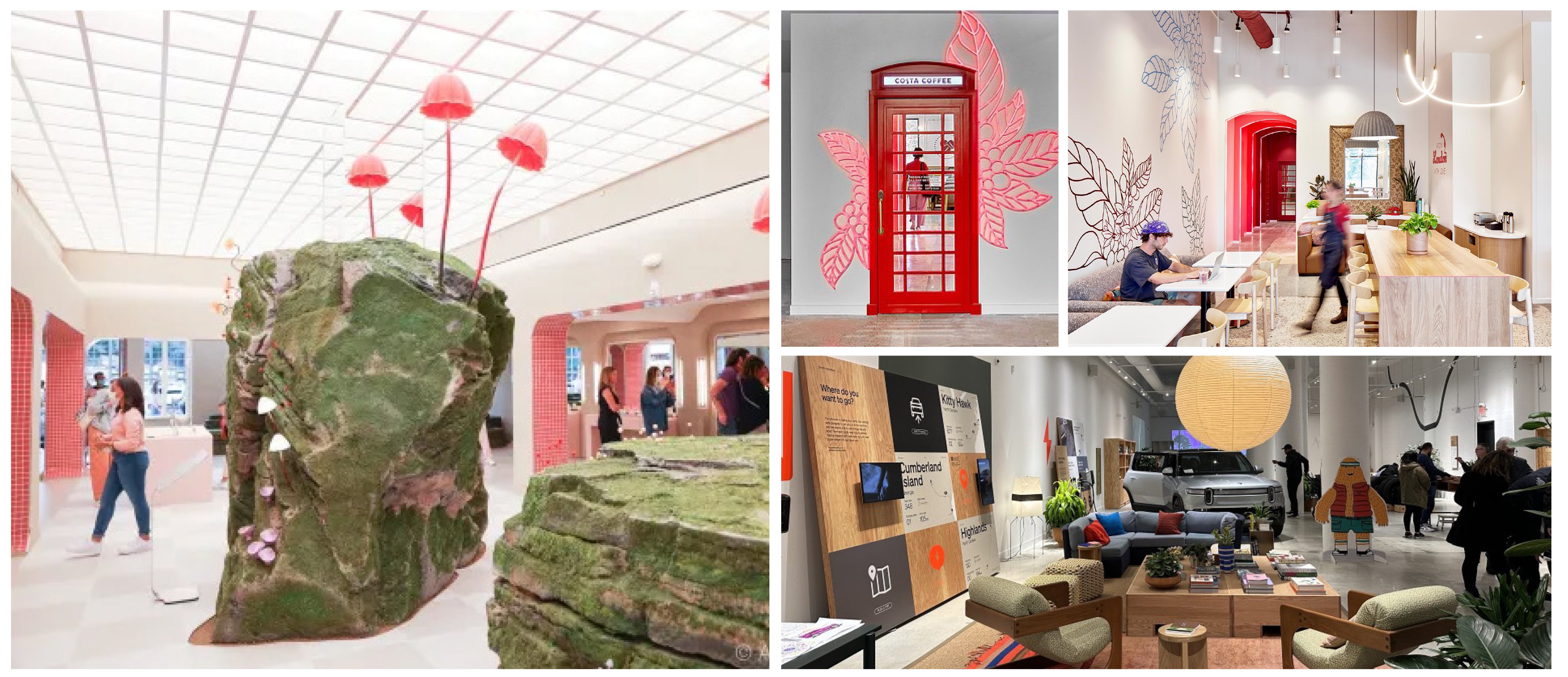
Organic shapes and layers augmented with lighting and bold colors and textures can inspire visual interest around a product or offering. Large color blocking also can provide a simple way to visually identify an area or zone or enhance a vignette.
Specific retail products also can support bold design, such as an Octanorm (an anodized aluminum extrusion that connects with a lock-and-tool system to create a display framework that can be illuminated in a variety of ways) or a split flats board, a modern take on the classic “departures” boards. These boards not only provide variable messaging, they also offer a familiar “clack-clack” sound when changing lettering, which sparks memories of past travels and delights viewers, young and old.
 From left to right clockwise: Glossier located in Seattle, Washington; Costa Coffee located in Atlanta, Georgia; Rivian Automotive showroom located in Atlanta, Georgia.
Eco-friendly design & sustainability
While there may be some backlash against so-called “virtue signaling” when retailers tout their recycling and sustainable practices, most of your customers — particularly younger ones — will appreciate any initiatives that support positive causes.
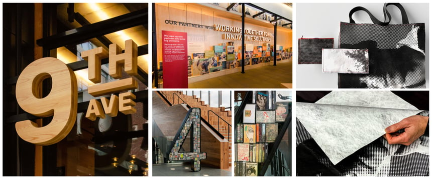
A little focused effort can find design paths that are both sustainable and economically advantageous, particularly in the long run. Store designs using natural materials selection that are locally sourced are worthy of a humble note to customers, as are recycling opportunities, both in-house and for shoppers. And using less PVC in favor of more naturally sustainable substrates is a compelling option.
Further, when possible, the integration of greenery into spaces to evoke a sense of calmness and being in touch with nature connects with many customers and associates. When done right, it can evoke a subtle “I want to be here,” feeling that ends up supporting your business’s bottom line.
 From top left to right: An example of directional signage created from reclaimed and recyclable materials; Gates Foundation Discovery Center located in Seattle, Washington.
And that is what our design team knows is priority one.
Design is creative. Designers feel pride in their craft.
But the successful endgame is a design, efficiently executed at scale, that thrills a client because it fosters a great experience for a targeted audience and delivers ROI.