QSR Tour: A Return to Designing as a Destination
The pandemic changed QSR customer touchpoints dramatically, accelerating digital adoptions that decreased person-to-person contact and increased convenience.
But, as we pivot toward 2023, what about pandemic-neglected, in-restaurant dining spaces, both inside and outside? Are they obsolete? Are customers going to again sit down and eat like it’s 2019? Or has this space’s needs evolved too?
It’s a relevant question because customers want options. A survey conducted in March 2022 asked whether adults in the United States ate out at quick service restaurants more or the same as before COVID-19. Approximately 70 percent of Millennials and 68 percent of Gen Z said they ate out at quick service restaurants more or the same as before the pandemic.
In other words, the future of QSR isn’t only about app development, pickup, drive-through and delivery. Restaurants also still need on-site spaces that are optimized for eating and brand engagement.
So, just as Miller Zell associates enjoy retail tours, we embraced an opportunity to take a jaunt around Atlanta and see how a variety of QSRs were serving their dine-in customers.

Kentucky Fried Chicken, Marietta, GA
The Big Chicken:
Celebrating KFC’s Brand Legacy
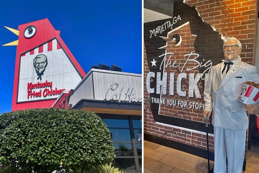
The iconic Big Chicken is a 56-foot-tall landmark in Marietta, Ga.
How big of a deal is it? After severe storm damage in 1993, public outcry played at least as much of a role in saving it as corporate initiative. First constructed in 1963, it underwent a $2 million renovation in 2017. The San Francisco Examiner observed it had become one “of the most well-recognized landmarks in Marietta and has an established history of impacting the local culture of the area.”
It’s more than KFC’s flagship. It’s the franchise’s beating heart. It features a gift store that offers souvenirs that compare the Big Chicken — with perhaps only a smidgeon of irony — to Big Ben and the Eiffel Tower.
Just as critical: It looks great, inside and out. The exterior features bold branding that celebrates Colonel Sanders alongside the Big Chicken. The drive-through carries over “Big Chicken” designs, with large-scale branding, “World Famous Chicken,” lettering sitting above the entrance. And there are nice, smaller touches, too, such as oversized spoons serving as door handles.
The interior features upscale finishes — painted real wood, brick and murals — and impressive lighting, with a focal chandelier wheel with a “chicken bucket” design concept. The main back wall celebrates “The Colonel” as a historical celebrity. Wayfinding throughout the restaurant is provided on high-quality black metal. Instead of prefab seating, the dining area featured a variety of table and chair designs and finishes.
The end result? KFC, despite undergoing many branding iterations through the years, leans hard into connecting its legacy with the present. The Big Chicken invites customers in as a landmark first, food second, but it also creates a connection to that very food through powerful storytelling and branding.
 Hattie B's Hot Chicken, Atlanta, GA
Hattie B’s Hot Chicken:
Upgraded QSR Experience
Hattie B’s Hot Chicken is a restaurant chain founded in 2012 in Nashville, Tenn. It now boasts 10 locations — including one inside The Cosmopolitan in Las Vegas — and the first Atlanta franchise opened in 2018.
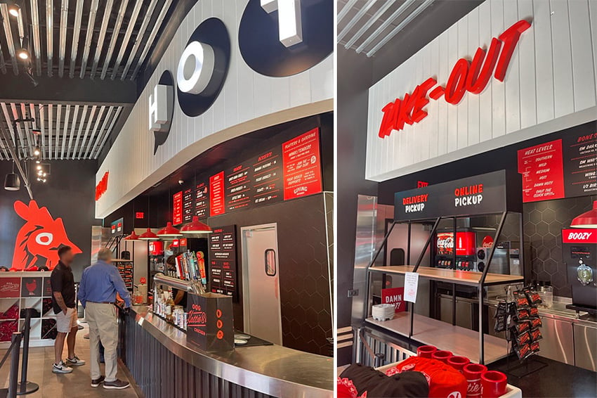
Upon arriving at the new West Midtown restaurant, we fortuitously found a location challenge — parking — was supported by clear signage directing customers to spaces across the street. The exterior features white with bold red accents and an inviting patio area with artificial turf and a cornhole setup. There also was a separate bar area with TVs for those who’d like an adult beverage with their spicy chicken.
The interior featured bold red, black and white colors with a simple but effective design, with a large, oversized chicken outlined in neon and a curved, overhead soffit with branding. Notably, a merchandising shop strategically divided an eat-in-restaurant queue line and another for pickup orders.
While there wasn’t a digital menu board, digital tablets were used for ordering, where numbers were provided to customers who then sat down and waited for food. Tables featured a burned logo on the side and a smoky look. Wayfinding was well done, as pickup and in-restaurant customers could immediately identify where to go.
Hattie B’s inhabits an area advancing from QSR to fast-casual, attempting successfully to communicate to customers that they can quickly grab some tasty chicken to go or sit down and watch local sports while washing down spicy food with a beer.
 Hero Doughnuts & Buns, Atlanta, GA
Hero Doughnuts & Buns:
Connecting Brand to Community
Hero Doughnuts & Buns introduces itself like this on its webpage:
Heroes wake up daily to lead by example. The simplicity of great food, made with good ingredients, in a cheerful atmosphere provides a jumping off point for heroic efforts. Hero is a place where community gathers, kids play, friends and colleagues meet, and Heroes can emerge — every day. Everybody needs a hero, be one today.
If you’re a cynic, you might smirk. But there’s something compelling about announcing bold brand aspirations that connect to your specific community. In this case, it’s a revitalized neighborhood called Summerhill, a redevelopment of Atlanta’s former Olympic stadium area, adjacent to downtown and near Georgia State University.
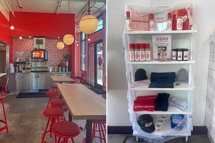
Hero is small but inviting, with effective medallion branding with a naming decal on the window. There’s a merchandise area by the entrance as you enter and queue. Colors are white with red accents. Counter fascia is white tile with red grout, creating an eye-catching pattern. Offerings are listed on chalkboards and printed menu boards that are connected with shower curtain hangers on piping for easy changes. A curved tile area provides a window view into the kitchen.
The dining area consists of tables and a bar area with a mixed use of wood and brand colored seating. There’s large, updated accent lighting. Signage and graphic wallpaper features amusing donut imagery and denotes pickup and beverage areas.
It was a little surprising to find Hero serves a full breakfast and lunch menu as well as alcohol, with a separate bar area outside. Some potential customers knowing that in advance due to external signage might find that alluring. A recent review celebrated the fried chicken sandwich and jalapeño kolache, “Conecuh sausage from Alabama swaddled in brioche.”
There’s a comfortable, curated feel here. It’s a space designed for location fit, so that the community of potential customers will seek out Hero as a destination to enter and experience, rather than just a grab and go.
Conclusions?
QSRs taking the initiative and seeking innovation for their in-restaurant dining areas will want to focus on: 1. targeted branding that connects with customers — both loyal and new; 2. upgrading the environmental experience, thereby drawing customers into dining areas; and 3. celebrating an authentic sense of community and shared values.
Want to hear more? We’d love to chat.