Chapter 1: What is Wayfinding Signage?
Before we get started, let’s get on the same page with the definition. Wayfinding signage is a system of visual cues strategically placed within environments to facilitate navigation. Its primary purpose is to orient and inform individuals, ensuring efficient movement from point A to point B within diverse settings such as retail stores, banks, hospitals and more.
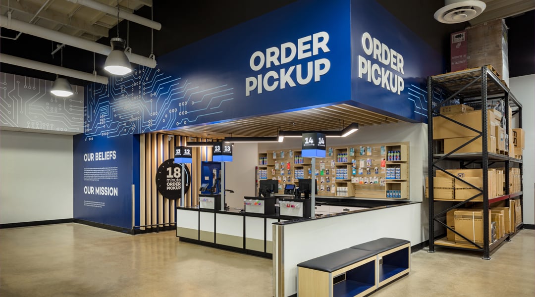
So, what are the four types of wayfinding signage? Miller Zell categorizes four sections of wayfinding signage: directional, informational, identification and regulatory.
- Directional signage guides individuals along specific paths or routes. An example is traffic flow signs.
- Informational signage provides crucial details about facilities or services.
- Identification signage labels key areas or departments.
- Regulatory signage communicates rules and safety information. This may include signs like emergency exits.

Why is creative wayfinding signage important?
Well, the main reason is that without signage, your customers have no information. That’s obvious.
But think about this:
A hospital has an average of 500 visitors per day. Without optimized wayfinding signage, each visitor spends an average of 10 minutes (on a good day) finding their destination. That’s around 5,000 minutes of wandering around a hospital, getting progressively antsy.
Now let’s say you’ve successfully revamped your signage system. This optimized wayfinding system reduces the average search time by each visitor to five minutes. You’ve effectively cut 42 cumulative hours per day, improved the customer experience and prevented staff from getting the brunt of confusion, frustration and ire.
That’s amazing, right? But there’s more. You’ve also improved brand loyalty. And not just for this hospital but all healthcare spaces under the brand umbrella.
This is why we stress the importance of effective wayfinding systems.
The foundation for effective wayfinding signage design
Before diving deeper into signage design, conducting a thorough wayfinding audit is essential. Whether this is a part of your full store audit or specifically for your signage, it’s important to get a baseline of the high-traffic areas and critical decision points where signage is most important. Here’s a high-level approach to what we do on ours:
- Preparation: Define your objectives (quantity, quality and weighted significance), gather documentation and assemble an internal or external team. How many footprints will you review?
- Observation: Conduct the walk-through, observe customer experience and identify critical paths to success. Take photos and mark moments that may affect multiple stores (e.g., No signage for the wine section across multiple branches).
- Report, recommend and reevaluate: Once your reports are ready – and are supported by plenty of photos – provide quantifiable recommendations and directions to complete them.
From your recommendations, what is your main goal? Examples might include:
- Promotional signage that increases sales of product/department by 35% over two quarters.
- Reaching 90% nationwide completion for consistent branding across all footprints.
- Lowering queue time by 15% through directional signage kit creation.
- Implementing digital kiosks with connecting apps in the five largest stores.
Once you’ve finished your review, you can use this data to address the areas of top concern. Then the design process can begin.
If you prefer a more extensive evaluation system, we’d suggest The Nielsen Norman Heuristic Evaluation Workbook. It’s free to download and set up to have the evaluators judge the project independently, then come together to share thoughts and ideas.
Chapter 3: Digital Wayfinding Signage
Digital wayfinding signage shines when it offers interactivity and personalization. The visitor experience in large venues, such as hospitals or malls, can be enhanced by providing real-time, interactive maps that guide users to their destinations, reducing frustration and improving efficiency. If you want to get even more creative:
- Enhance digital wayfinding by developing an augmented reality (AR) mobile app that overlays directional arrows and information onto the user’s real-world view, making navigation intuitive and engaging.
- Install interactive touchscreen kiosks at strategic locations, offering personalized recommendations based on user preferences, such as suggesting nearby stores or promotions in a shopping mall.
- Implement voice-activated digital assistants throughout venues to provide step-by-step directions and contextual information when users ask for help.
These innovations make navigation more interactive, personalized and accessible, significantly improving the overall user experience. 
Chapter 4: Common Challenges and How to Overcome Them
In our 60 years of designing branded spaces, we’ve seen a lot. So here are the top issues Miller Zell often encounters and how we’ve worked with our partners to mitigate risk.
Confusing layouts: A tangled layout that you can’t change? Floor markings, like lines, arrows or footprints, can also lead people through the space. Maintaining consistent branding throughout the wayfinding system reinforces the brand identity and creates a cohesive experience for users. IKEA is an excellent example of this, creating walls and signage that guide customers on a journey.
If your budget allows, effective wayfinding also often incorporates technology. This can include integrating digital displays, interactive maps and mobile apps to provide dynamic and up-to-date assistance.
Information overload: You have a lot of information you need to get across, and throwing it all on signage would be terrible. We recommend enlisting a third party (like us!) to help prioritize information; an outside viewpoint is often necessary. When in doubt, space it out – finding key decision points in the user journey prevents overwhelming customers all at once. Incorporating digital signage can manage information dynamically, for easy updates and targeted messaging based on real-time needs!
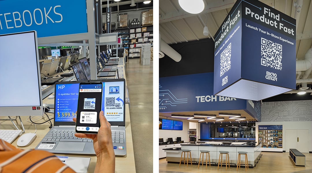
QR codes on your signs is a great way to manage and distribute information. With the right placement, it can connect to you website, an app or even temporary promotions. Micro Center used large QR codes in their design and being an electronics store, added to the feeling of digital innovation.
Judging signage effectiveness: Surveys and studies provide invaluable insights into signage effectiveness. Analyzing data-driven metrics enables continual improvement, refining signage strategies to better meet evolving user needs and expectations.

Maintenance: Regular maintenance involves repairing and updating signage components as needed. Timely replacements and updates to information and graphics prevent confusion and maintain relevance. Implementing proactive maintenance strategies preserves the integrity and functionality of the signage system.

Sustainability: While we get more into this topic in this article, here is a summary. The ways for sustainable interior design and thoughtful material selection to balance durability with environmental impact are endless.
In the interest of transparency, they frequently cost more to utilize, which can occasionally catch clients off guard. Select materials that are sustainable and easy to maintain because that minimizes long-term operational costs.